When it comes to YouTube, you know what they say: first impressions matter. Your video might have killer content, but if the thumbnail isn’t snazzy enough to stop scrolling thumbs, it’s like a gourmet meal served on a paper plate – just doesn’t cut it! In the vast ocean of videos vying for attention, a standout thumbnail can be your lifebuoy, drawing in viewers like moths to a flame. So, how do you create those eye-catching visuals that get clicks faster than a cat video goes viral? Let’s dive into some savvy tips and tricks that’ll help you master the art of YouTube thumbnails and put your videos on the map!
Creating a Visual Hook that Stops the Scroll

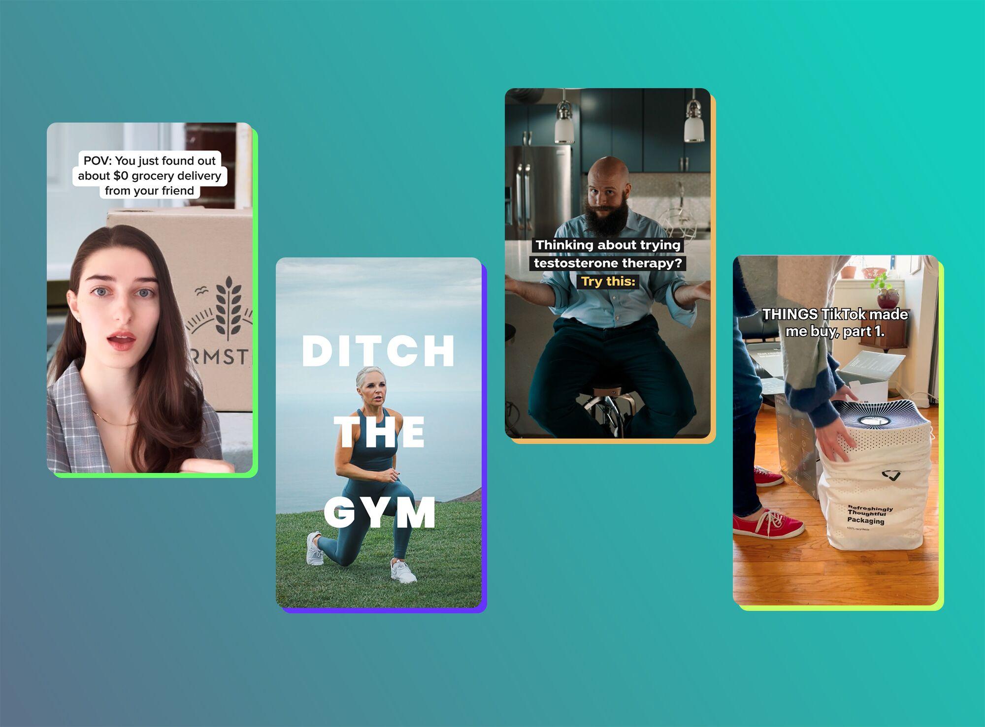
When it comes to grabbing attention, your thumbnail is your first impression—like an appetizer before the main meal. You want something that not only looks good but makes people say, “I need to see more of that!” Start with a bold, bright palette that reflects your video’s vibe. Use high-contrast colors to help your thumbnail pop, ensuring it stands out in a sea of similar videos. Don’t forget about faces! Thumbnails with expressive human faces tend to draw more clicks. Use close-ups to convey emotion; remember, curiosity is a powerful motivator.
Text can be a game-changer too— a few punchy words can say more than a picture sometimes. Choose a font that’s both readable and attention-grabbing, especially when your thumbnail is shrunk down. Keep it brief; less is more! A good rule of thumb? Aim for three to five words max. Consider adding visual elements like arrows or question marks to lead the viewer’s gaze or provoke intrigue. Lastly, make sure your thumbnail aligns with the content of your video. Mismatched expectations might get you clicks, but they’ll hurt your engagement in the long run.
Color Theory: Choosing Shades that Grab Attention
When it comes to designing thumbnails that truly stand out, color is your secret weapon. Think of your thumbnail as a storefront window: it needs to draw people in from afar. Using contrasting colors can be incredibly effective here—picture a bright yellow against a deep blue. This not just grabs attention but also makes the text readable at a glance. A splash of vibrant red or electric blue can evoke emotions and prompt clicks, so consider what feelings you want to inspire in your audience. By integrating a few eye-catching shades rather than a clutter of hues, you create a clean and striking aesthetic that feels intentional.
Additionally, don’t underestimate the psychological impact colors have on viewers. Research shows that colors speak volumes about the content you present. For instance, blue often conveys trust and reliability, while orange can incite a sense of urgency. It helps to plan your color scheme around your brand’s personality. Here’s a quick reference to some colors and their potential meanings:
| Color | Emotion/Meaning |
|---|---|
| Red | Excitement, passion |
| Blue | Trust, calmness |
| Green | Growth, peace |
| Yellow | Joy, optimism |
| Purple | Creativity, luxury |
So, the next time you sit down to create a thumbnail, think about color choice as more than just aesthetics—it’s about crafting a visual message that resonates. Optimize the shades you use to ensure your thumbnails don’t just stand out; they stick in people’s minds like the last piece of chocolate cake at a party. Go bold, go strategic, and watch your click-through rates rise!
Typography that Pops: Fonts and Text Placement Strategies

Choosing the right fonts for your YouTube thumbnails can make a world of difference. Think of it like dressing up for a first date; you want to make a killer impression! The right font will not only communicate your message but also set the vibe. Bold, sans-serif fonts tend to work wonders for clarity and legibility, especially when viewed on smaller screens. If you want to add a touch of personality, consider using a script typeface for a playful twist, but keep it minimal to avoid overwhelming viewers. When it comes to placement, aim for the 60/40 rule — let your visuals take up 60% of the space and let the text neatly occupy 40%. This way, you maintain that eye-catching balance without cramming too much info into one tiny thumbnail.
Another crucial aspect is color contrast. Imagine you’re trying to read a message in a dimly lit room; it’s frustrating, right? Utilize colors that pop against each other to ensure your text doesn’t get lost in the background. Complementary colors can enhance readability and draw the viewer’s eye right where you want it. It’s also a good idea to maintain a consistent style across your thumbnails. Create a defined typography hierarchy by using different font sizes to indicate what’s most important, as illustrated in the table below:
| Font Size | Usage |
|---|---|
| 48px | Main Title |
| 36px | Subtitle |
| 24px | Call to Action |
Testing and Analyzing for Thumbnail Perfection

When it comes to achieving that perfect thumbnail, it’s all about testing and analyzing what truly catches your audience’s eye. Start by creating a variety of thumbnails that utilize different colors, fonts, and images. This is like a tasting menu for your audience; you want to see what flavors they enjoy the most. Tools such as A/B testing can be incredibly helpful—each version reveals insights into what resonates with your viewers. Have you ever thought about how a bright red apple stands out against a dull background? Similarly, a well-contrasted thumbnail can make your video irresistible. Remember, engagement isn’t just about drawing attention; it’s about holding it long enough to make them click.
Once you’ve tested a handful of designs, it’s time to dive into the analytics. Look closely at metrics like click-through rate (CTR), watch time, and audience retention. You’re not just sifting through numbers; you’re hunting for clues. Ask yourself questions: What elements are working? Did a particular color scheme lead to a spike in clicks? Here’s a quick comparison table to help you visualize the results from different thumbnails. Tracking these patterns is crucial—like finding the right bait when you’re fishing. If one style consistently hooks viewers, you’ve struck gold!
| Thumbnail Style | CTR (%) | Watch Time (mins) | Audience Retention (%) |
|---|---|---|---|
| Bright Colors | 12 | 4.5 | 60 |
| Minimalist Design | 8 | 3.2 | 45 |
| Text Overlay | 15 | 5.1 | 70 |
| Candid Photo | 9 | 3.8 | 50 |
Key Takeaways
And there you have it! Crafting the perfect YouTube thumbnail is like setting the stage for a captivating show – it’s all about making that first impression count. With these tips in your toolkit, you’re not just throwing up random images; you’re creating visual hooks that’ll reel in viewers faster than a cat chasing a laser pointer. Remember, your thumbnail is often the first thing potential subscribers see, so it should be as inviting as a cozy coffee shop on a Sunday morning.
Don’t be afraid to experiment! Play with colors, fonts, and images until you find that sweet spot that represents your brand while intriguing your audience. You’ve got the knowledge, now it’s time to put it into action. So go ahead, get creative, and watch your clicks soar!
Got any more tips or ideas brewing? I’d love to hear them! Until next time, keep those thumbnails popping and your content shining. Happy creating!


